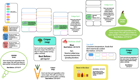
These were our initial label designs. We decided that we wanted to go for one that was quite simple, but informative, so initially we chose the one below.
We chose this label as it had a bold colour, which caught the eye. We were going to colour code each different category so that it was easily identifiable. It had the most important information on (where to store each item of food) in the colourful part at the top, as that is the first thing your eye will be drawn too. We then had some extra information which would either be the reason why you store your food there, or an interesting fact about food storage. At the bottom it then had the best before date. However we received feedback saying that essentially the label is a bit boring and we would be better to have something that was a little more visual. It was suggested that the label could be an actual outline of each food (meat, fish etc.) so we went back to the drawing board.
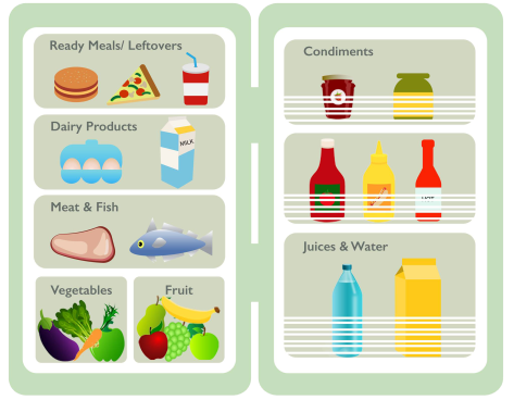
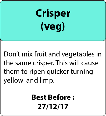
I came up with these as our final label idea. Each label will be something that represents that specific food category, so the pear represents fruit, Juice carton – juice/drinks, fish – fish, slice of meat – meat, eggs – egg box, dairy – cheese, broccoli – vegetables, ready meals – container/pot, condiments – jar.
Overall I think that these labels look a lot better than our original design. It is a lot more visual, but we have kept the designs simple without too much detail. They will definitely catch the eye when on the packaging, which is what we want. In order for our concept to work, the label needs to catch the attention of people so that they will read the information. When we first received the feedback we were worried that using the actual food item to represent the label would look a bit childish. However, I think these designs work well and we managed to make them look fun without being childish, which will appeal to adults.