Interaction Design – Colouring Book

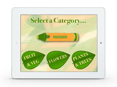
These are some of the colouring book pages to give a general idea. It will start of with a blank outline of the ‘WonderCreature’. The child will have to go and find it in real life and once they have found it use the pen to pick up the colour of it and then colour it in in their digital colouring book. If they get the colour wrong the ‘WonderCreature’ will animate on the page and tell them that they got it wrong and ask them to try again. Once they have got the correct colour the ‘WonderCreature’ will animate again and praise them and tell them an interesting fact about themselves!

At the end of each category, all the ‘WonderCreatures’ from that category will come together to praise the child, they will then go onto the next category. When they have completed all three categories, all of the ‘WonderCreatures’ that they have coloured in will come to life and congratulate them on finishing the book. I think this will help the children to engage and relate more to each ‘WonderCreature’ encouraging them to want to learn more about them.

E McAleer - Summative24

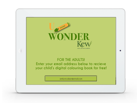
The final page will be for the adults (parents or teachers). The child will return the iPad back and there will be a page where the adult can fill in their email address. By doing this they will able to receive their child’s digital colouring book for free, via email.

I think my UWonder series is a very simple but engaging concept for children. By making it a fun and magical experience it encourages kids to want to learn more about the outside world and interact with it, which is what I want to promote.

Interaction Design – Instructions

E McAleer - Summative5

This would be the first page that shows up when the child receives the iPad. It will have the UWonder logo along with the Kew Royal Botanical Gardens logo. They can touch anywhere on the screen in order to start the digital colouring book. It will then go onto the menu page…….

E McAleer - Summative6

Here the child will be able to select a category. In each category there are 5 ‘WonderCreatures’ to colour in. For example in the first category there will be 3 fruits to find and 3 veg to find, the second category they will have to find and colour in 6 different types of flowers, and in the plants and trees category there will be 3 tree species and 3 plant species to complete. Once they select on of the categories it will go onto the instruction pages… Each category they click on will go straight to the Instruction page, however they are able to exit the instruction page by clicking the X in the right hand corner to carry on straight to the colouring. The instruction pages below give the child a step-by-step guide on what they need to do to complete the colouring book and how to use the pen correctly.

E McAleer - Summative7

The first instruction page is the key. Here is where the children can find the meaning for each icon and ‘Wonder term’ used throughout the colouring book. I have kept everything within the same colour scheme (previously discussed) to keep unity throughout the colouring book – all natural colours to help set the botanical garden feel.


Interaction Design – iPad cover

iPad cover

I designed a cover for the iPad, because it is for kids, I thought I needed something for the iPad to be protected throughout the experience. I chose a simple iPad cover design that is practical and not too distracting. I have the logo on the front and on the back, as well as one of the characters on the back to make it a bit more fun. I chose a bright green colour as it fitted in with the colour scheme and thought it would grab the eye. At first I thought I would have a paint palette holder for the iPad, however after further research and tests I felt that this would be a bit awkward for a child to hold, especially if they want to turn the iPad around to colour at different angles. It would also be more costly as there would need to be two types of paint palettes developed – one for right handed children and one for left handed children. In the end I thought a simpler design would be more practical and less distracting.

Interaction Design – Wonder Series

Focus : Botanical Gardens/Forests

Problem : Children are not interested/bored easily of learning about different species

Solution : Interactive pen and colouring/information book

Groups of children go on a school trip to a botanical garden/forest and get given an interactive pen and colouring book.

The child will find each specie that is in the book. Once they find it they will touch it with the pen, which will pick up it’s exact colour through a colour scanner/sensor and the child will have to colour in the specie exactly how it looks in reality.

Once they have completed the colouring, the book will reveal a fun fact about the specie.

Name : UWonder – because kids are always intrigued by new things, making them wonder.

Brand – Kew Royal Botanical Gardens

The UWONDER Series :

WonderPen – Digital colouring pen

Bluetooth pen that charges in ten minutes and gives five hours of use

Connect pen to iPad by pressing the green button three times

Hold the green button down and touch the specie to colour identify and once the pens ‘magic’ has identified the correct colour it will light up

Colour in the picture on the iPad

Simple, fun and safe

Species – WonderCreatures

In each category there are 6/6 characters to colour

Visual Concept 1

This is my visual concept for the UWonder series. It is just the Logo and a small tag line with an image representing the idea.  I wanted to make it quite a magical idea, where children are intrigued to learn…


Interaction Design – Branding

I had some trouble trying to think of a name for a concept and connecting it with some sort of brand.

At first I thought of Crayola, but quickly realised they already have their own digital brand and tend to only use their own products (crayons).

I then thought that because I am using an iPad I could use Apple as a brand. However I quickly realised that Apple have a very distinct style and this was quite hard to replicate in my own designs, especially because it is for kids. Apple is very modern and appeals more to tech-savy teens and adults.

I then looked at different Botanical Gardens etc. and decided to go with Kew, Royal Botanical Gardens. I am trying to find a solution for children being bored when learning about plants etc. and trying to find a way to help them interact with the outside world more. Kew Gardens are very well known, and thus would really benefit from having something that will engage kids more. This will be great for kids with their parents as well as for school trips.

Having found a brand I decided to work on the branding and colour scheme : UWONDER

I decided to call the concept UWonder. Kids are always intrigues by new and exciting things, and the word wondering adds a little bit of mystery and magic into the concept. I thought it also worked well because I could use the word wonder and branch off of that idea for to name the pen and characters (pen – WonderPen, species – WonderCreatures). I thought this would help the children relate more to the whole idea. I chose a very natural/earthy colour scheme. I thought they were bight enough to engage the children but also link well to the natural colours within the botanical garden. I did not want to use blues, pinks etc as I thought the earthy colours would tie in better to the whole theme and look more united and not too distracting.

COLOUR 2